The Temporal Shift: Why Data Volatility and Static Comparisons Divide Band 6.0 and 8.0
Most candidates approach IELTS Writing Task 1 as a translation exercise: see a picture, turn it into words. However, data from the [official IELTS band descriptors](https://www.ielts.org/for-researchers/band-descriptors) suggests that achieving a Band 7.0 or higher requires more than just description; it requires a sophisticated 'overview' that identifies significant trends and relationships.
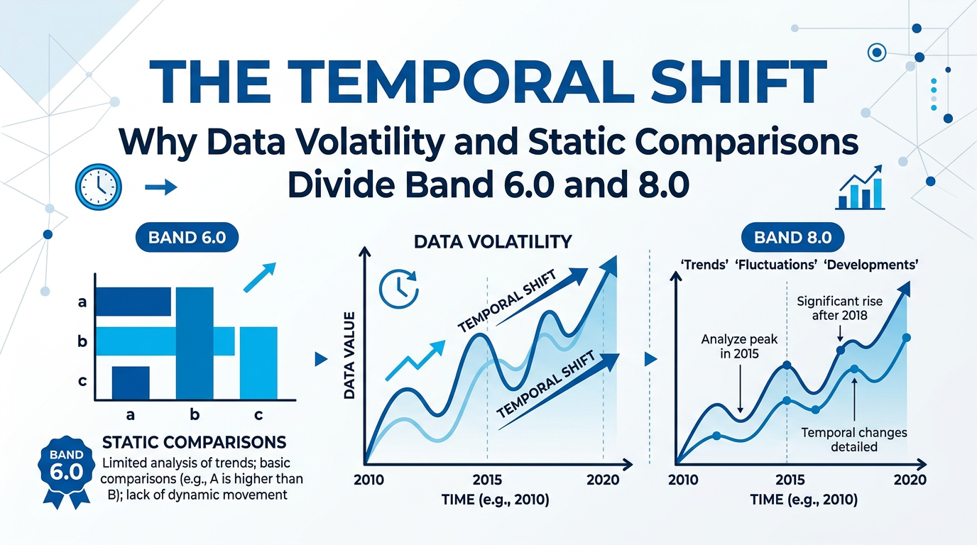
The technical divergence between a line graph and a bar chart isn't just aesthetic—it’s cognitive. A line graph demands an analysis of velocity and momentum, while a bar chart often necessitates a static hierarchy. Understanding this distinction is the difference between a mechanical Band 6.0 response and a nuanced Band 8.5.
The Kinetic Logic of Line Graphs
When you see a line graph, your brain should immediately switch to 'kinetic mode.' Line graphs are almost always about time. Because the data points are connected, the examiner is looking for your ability to describe the nature of the movement. Is it erratic? Is it a plateau?
A common pitfall is 'point-pecking'—describing every single year on the X-axis. Research into [cognitive load and data visualization](https://scholar.google.com/scholar?q=cognitive+load+in+trend+analysis) highlights that human readers prioritize the 'slope' over individual data points. In IELTS terms, this means using 'adverb-verb' combinations like sharply plummeted or gradually fluctuated.
> Quick Tip: For line graphs, never use 'compared to' as your primary engine. Use words that denote movement: surpassed, overtook, bottomed out, or peaked.
The Hierarchical Logic of Bar Charts
Bar charts are different beasts. While they can show time, they are frequently used for 'cross-sectional' data—comparing different countries, age groups, or sectors at a single point in time. Here, the 'kinetic' language of line graphs (like 'fell' or 'rose') is often factually incorrect. If a bar for 'Apples' is shorter than 'Oranges,' the data didn't 'fall'; it is simply 'lower.'
According to [pedagogical research from Cambridge University Press](https://www.cambridge.org/elt), learners often struggle with the 'functional language of comparison' required for static charts. Instead of focusing on trends, you must focus on rank and proportion. Use superlatives (the most significant, the least popular) and fractional qualifiers (half as many, a three-fold difference).
The 'Volatility Gap': A Surprising Metric
Did you know that according to [linguistic analysis of high-scoring scripts](https://www.researchgate.net/search.Search.html?query=IELTS+writing+task+1+lexical+density), the highest-scoring candidates use significantly more 'degree of change' modifiers?
Consider this delta:
* Band 6.0: "The price went up and then it went down."
* Band 8.0: "The price underwent a period of significant volatility, punctuated by a dramatic peak in 2012 before reverting to its initial levels."
The second example doesn't just describe the data; it characterizes the environment of the data. To reach this level, tools like Writing Pro can provide sub-skill analysis, pinpointing whether your weakness lies in lexical resource (vocabulary) or grammatical range.
A Step-by-Step Method for Data Synthesis
To ensure you don’t get lost in the numbers, follow this 4-step 'Anchor Method':
Avoiding the 'Mechanical' Trap
Many students rely on 'The [Growth Engine](https://scholar.google.com/scholar?q=IELTS+instructional+design+for+task+1)' of memorized templates. However, [studies indexed on Google Scholar](https://scholar.google.com) regarding second language acquisition suggest that over-reliance on rigid templates can actually lower scores in 'Task Response' because the candidate fails to adapt to the specific nuances of the data.
For example, if a bar chart shows a 90% drop between two categories, simply saying it is 'lower' is an understatement. You need 'extremity' language: "A staggering disparity exists between..."
Leveraging AI for Precision
To bridge the gap between a 6.5 and a 7.5, you need a feedback loop. Using the AI Roadmap feature allows you to see exactly where your data description becomes repetitive. If you find yourself using 'increased' five times, the Band Prediction tool will likely flag your Lexical Resource. Use an AI Speaking Examiner or writing tool to practice converting raw data into spoken summaries, which reinforces the neural pathways needed for quick data interpretation during the real exam.
Common Mistakes to Avoid
* The Tense Mix-up: Using the present tense for data from 1990. Always check the dates. If no date is provided, use the present simple.
* Over-reporting: Trying to mention every single bar in a 12-bar chart. This leads to a lack of 'cohesion,' a key metric in the [official scoring criteria](https://www.ielts.org/for-researchers/band-descriptors).
* Mathematical Errors: Saying 'double' when the data only grew by 50%. Accuracy is paramount for 'Task Achievement.'
Conclusion: The Expert's Edge
In the competition for high bands, the line graph and the bar chart are not just different layouts—they are different languages. The line graph is the language of change, requiring a mastery of verbs and adverbs. The bar chart is the language of status, requiring a mastery of adjectives and prepositions.
By treating the data as a story of either 'momentum' or 'hierarchy,' you demonstrate to the examiner that you aren't just a student who memorized a list of words, but a professional capable of high-level data interpretation. Focus on the 'slope' for lines and the 'gap' for bars, and your score will follow the upward trend you’ve worked so hard to describe.